Product Updates
We’re always improving Ninety to help you work smarter, stay aligned, and achieve more.
Preview
Ask Maz. The AI built for EOS®.
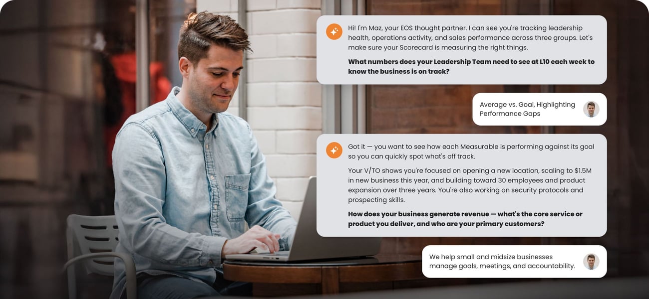
Get to what matters, when you need it most.
Maz, Ninety’s AI assistant, now answers questions about your business through Ask Maz — a conversation right inside Ninety. Instead of digging through Scorecards, Rocks, Issues, meeting history, your Accountability Chart®, and your V/TO®, ask a question and get a clear answer in seconds. Maz works from your live company data inside Ninety, with nothing to connect or configure. You can turn what you find into Issues, To-Dos, and Headlines right from the conversation — so you walk into your next meeting already knowing where to focus.
New Features


Want to stay in the loop with what is new at Ninety?
Subscribe to our product updates emails, or view our product updates blog.


Become a Beta Tester & try new products first
Sign up to be a beta tester and get early access to Ninety's latest enhancements. Provide us your feedback and help inform our product development.
Become a beta tester today
